A summary by Eric Simons
Value of Illustrations
One of the strengths of archaeological illustrations is their capacity to abstract, accentuate, and collage features. An illustration can combine different visual styles, different moments in time, different landscapes and ideas; they may demonstrate methods, findings, and theory all in one image! These properties can make multimedia illustration techniques valuable when explaining archaeological work to colleagues, community members, and the press media and public.
For archaeological work in mortuary contexts, illustration can hold one other advantage. Much of the material we work with—maps of cemeteries, photographs of burial sites, remote sensing data gathered from suspected burial areas—are not suitable to share broadly; they are collected to serve our interpretations and to be given to those for whom we do the work. Because illustrations allow us to abstract and remix, explaining how we work without sharing information specific to sites we work at or sharing imagery of specific sacred and forensic spaces, they can be particularly valuable in sensitive and confidential circumstances.
The image collection, below, illustrates the ways in which ground-penetrating radar (GPR) data is collected, assembled, and interpreted, particularly in searches for burials.
Shared Use
This collection of illustrations is intended to be available for use by all who are involved in this work. They fall under Creative Commons licensing. You may use them, with appropriate credit (see individual images, below, for licensing details).
This collection is also a work in progress. As the practice of using GPR in burial contexts develops, and the audiences for this work continue to grow and vary, undoubtedly our need for explanatory and illustrative material will also grow.
Please contact me if you have suggestions for additional illustrations, or questions or comments on any that have already been produced.
The Image Collection
Figure 1: GPR Workings

![]()
Illustration by Eric Simons. This work is licensed under a Creative Commons Attribution-NonCommercial-NoDerivatives 4.0 International License
This drawing, originally produced for an article in the anthropology magazine Sapiens.org, illustrates the basic functioning of a GPR machine. GPR works in a similar fashion to sonar: a signal is repeatedly emitted from the Transmitter in the radar array, directed down into the ground as the machine is pushed along. That signal penetrates the earth, and as it reaches objects or significant changes in the soil stratigraphy, it refracts and reflects. Some of that reflected signal makes its way back to the machine, collected by the Receiver and stored in the Console. GPR units equipped with GPS Units will encode the GPR data with spatial information; for those units without GPR, traditional mapping techniques are used to locate the GPR data on the landscape. When used in a suspected burial context, GPR technology is most effective at recognizing changes in the composition and density of soil. So, as illustrated here, burials are most likely to be identified when the GPR signal detects disturbances in soil stratigraphy caused by the digging and infilling of a burial pit.
Figure 2: Collecting Radargrams

![]()
Illustration by Eric Simons. This work is licensed under a Creative Commons Attribution-NonCommercial-NoDerivatives 4.0 International License
This image is meant to demonstrate how radargrams are collected and what they correspond to on the landscape. Radargrams are ‘built’ as thousands of signals are transmitted and received sequentially as the GPR machine is moved along the ground. These radargrams are ‘slices’—two-dimensional planes of data that run in parallel to the line pushed by the GPR machine, penetrating a few metres into the ground.
Figure 3: Gridded Radargrams to Amplitude Maps
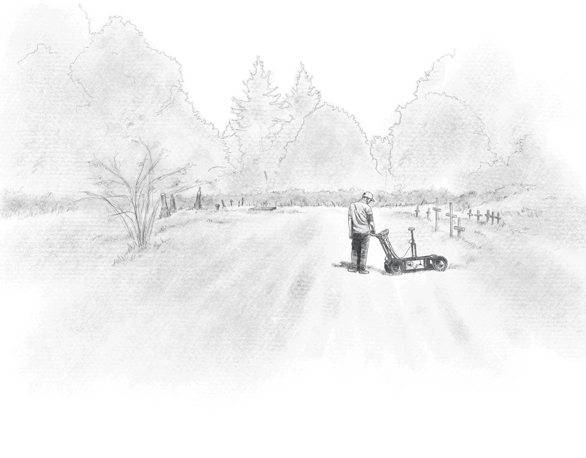
Illustration by Eric Simons. This work is licensed under a Creative Commons Attribution-NonCommercial-NoDerivatives 4.0 International License
Sometimes GPR data is collected in prospection mode—perhaps a single line pushed over a long distance, with the operator monitoring the data as it is collected in order to narrow a search area. But when it's time to do a more focused examination of a smaller area, GPR data is most often collected in grids. GPR software is then able to aggregate these individual lines of data—the radargrams—into a topographical amplitude map (sometimes referred to colloquially as a "heat map").
Figure 4: Amplitude Maps on the Landscape
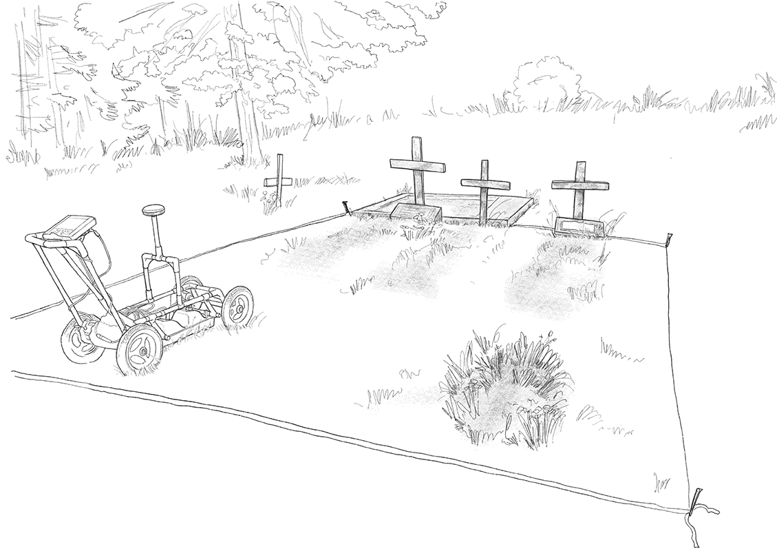
Illustration by Eric Simons. This work is licensed under a Creative Commons Attribution-NonCommercial-NoDerivatives 4.0 International License
Here, the goal is to illustrate how amplitude maps relate to the landscapes from which they are generated. The animation moves our ‘vision’ down through the ground; the initial image shows very little, but as the two-dimensional amplitude maps from deeper and deeper into the earth are revealed, certain ‘hotspots’ emerge. Three hotspots, near the back, are clearly associated with the illustrated grave markers. A fourth, at top-left, does not appear to have a grave marker but is in parallel to the other three. A fifth, at bottom right, also has no grave marker—but if we look at the illustration of the surface, we see that there is an associated depression in the earth: a significant clue that a burial may lie beneath.
Forthcoming:
Figure: Line-spacing Considerations
Figure: 3d Data-Modelling
Figure: Knowledge Sources